ラベル Gnuplot の投稿を表示しています。 すべての投稿を表示

2015年5月14日木曜日

Gnuplot で X 座標が時刻のグラフに矢印や文字を描画

Gnuplot で X 座標が時刻のグラフに矢印や文字を描画してみました。グラフの X 座標が時刻なので矢印や文字も X 座標は時刻で指定しますが、項目によっては相対座標を数値で指定することもできました。

環境

  • Ubuntu 14.04 (Trusty Tahr) Server
  • Gnuplot 4.6 patchlevel 4

グラフに矢印を描画

以下のような Gnuplot コマンドファイル arrow.plt を用意します。

# 日時データグラフを描画するための各種設定
set terminal png size 640,240
set xdata time
set format x "%m/%d\n%H:%M"
set timefmt '%Y-%m-%d %H:%M:%S'
set xrange ['2015-05-13 23:00:00':'2015-05-14 01:00:00']
set yrange [100:300]
set xtics 900

# 矢印のスタイル 1の設定
# style arrow 1:
#   矢印スタイル番号 1
# size character 1.2, 20:
#   アローヘッドの大きさは文字(character)の大きさの 1.2倍
#   角度は 20度
# filled:
#   アローヘッドを塗りつぶし
set style arrow 1 size character 1.2, 20 filled linewidth 2

# 矢印 1を描画
# X 座標を時刻で指定しています。
# arrowstyle 1:
#   上で設定したスタイル番号 1を指定
set arrow 1 \
        from '2015-05-13 23:10:00',150 \
        to   '2015-05-14 00:45:00',250 \
        arrowstyle 1

# 矢印のスタイル 2の設定
# empty:
#   アローヘッドを塗りつぶさない
# linecolor rgbcolor 'red':
#   色は赤色
set style arrow 2 size character 3.2, 15 empty linewidth 4 linecolor rgbcolor 'red'

# 矢印 2 を描画
# rto  1800,100:
#   終点を始点からの相対座標で指定しています。
#   日時座標の場合は秒数で指定するようです。
set arrow 2 \
        from '2015-05-13 23:15:00',120 \
        rto  1800,100 \
        arrowstyle 2

#データが空のグラフを書いてます。
plot '-' using 1:3
end

グラフ画像ファイルを作成

$ gnuplot arrow.plt > arrow.png
"arrow.plt", line 47: warning: Skipping data file with no valid points
  • グラフデータが無く空グラフなのでワーニングが出ますが無視してください。

以下のグラフ画像ファイルができました。

https://blogger.googleusercontent.com/img/b/R29vZ2xl/AVvXsEjJk29fYTf5-SS1KHTOVOgQzgvg55pZCY_16GdeHjbgRxmmnSWrDv95H_iQjBcKsGFUA04sYtmfkXpRZmckbYNiO7f7pPSfoVcbNqpJW7jXZCUURJ9Kyg8HI5-kupWYnl7cWXVFZEz-/s1600/arrow.png

グラフに文字を描画

以下のような Gnuplot コマンドファイル character.plt を用意します。

# 日時データグラフを描画するための各種設定
set terminal png size 640,240
set xdata time
set format x "%m/%d\n%H:%M"
set timefmt '%Y-%m-%d %H:%M:%S'
set xrange ['2015-05-13 23:00:00':'2015-05-14 01:00:00']
set yrange [100:300]
set xtics 900

set label 1 center at first '2015-05-13 23:15:10', 250 'Hello'

#データが空のグラフを書いてます。
plot '-' using 1:3
end

グラフ画像ファイルを作成

$ gnuplot character.plt > character.png
"character.plt", line 14: warning: Skipping data file with no valid points

以下のグラフ画像ファイルができました。

https://blogger.googleusercontent.com/img/b/R29vZ2xl/AVvXsEhQbUHFuo7uDTRg0ihszcn1BE84zpp-38-La3do5ITyl01M16TwrgIit0FMnUpNwG6iDSiF_AmGEBl4-7BdyYSgSUGIW-rWZ1l1BUwR3ce8eZj1kZa0qkZAAxwRNoBwZJOReE09kydt/s1600/character.png

2015年5月9日土曜日

Ubuntu で Gnuplot で X11 ウィンドウにグラフ描画

Ubuntu に Gnuplot をインストールして、X11 ウィンドウに描画しようとしたらうまくいかずに少しはまったのでブログに残しておきます。

環境

  • Ubuntu 14.04 (Trusty Tahr) Server

まず gnuplot パッケージのみインストールします。

$ sudo apt-get install gnuplot

gnuplot を実行すると以下のように最後に Terminal type set to 'unknown' と表示されました。

$ gnuplot

    G N U P L O T
    Version 4.6 patchlevel 4    last modified 2013-10-02
    Build System: Linux x86_64

    Copyright (C) 1986-1993, 1998, 2004, 2007-2013
    Thomas Williams, Colin Kelley and many others

    gnuplot home:     http://www.gnuplot.info
    faq, bugs, etc:   type "help FAQ"
    immediate help:   type "help"  (plot window: hit 'h')

Terminal type set to 'unknown'
gnuplot>

terminal を x11 に変更しようとしても以下のようにエラーになります。

gnuplot> set terminal x11
Terminal type set to 'unknown'
                      ^
         unknown or ambiguous terminal type; type just 'set terminal' for a list

この状態でグラフを描画してもなにも表示されません。

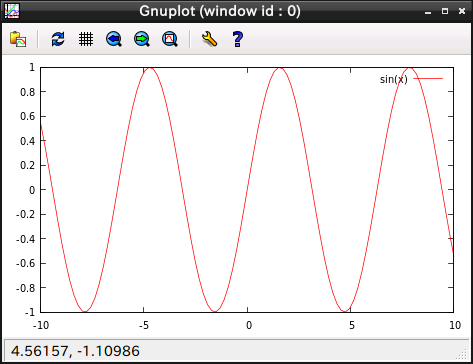
gnuplot> plot sin(x)
  • X11 ウィンドウに描画されたグラフが表示されて欲しいのですが、なにも表示されません。

ぐぐってみると、Ubuntu の場合は gnuplot-x11 が必要なのでこれもインストールします。

$ sudo apt-get install gnuplot-x11

gnuplot を実行すると Terminal type set to 'unknown' となっていた箇所が Terminal type set to 'wxt' と表示されました。

$ gnuplot

    G N U P L O T
    Version 4.6 patchlevel 4    last modified 2013-10-02
    Build System: Linux x86_64

    Copyright (C) 1986-1993, 1998, 2004, 2007-2013
    Thomas Williams, Colin Kelley and many others

    gnuplot home:     http://www.gnuplot.info
    faq, bugs, etc:   type "help FAQ"
    immediate help:   type "help"  (plot window: hit 'h')

Terminal type set to 'wxt'
gnuplot>

無事、X11 ウィンドウに描画されました。

gnuplot> plot sin(x)
https://blogger.googleusercontent.com/img/b/R29vZ2xl/AVvXsEhjnmEQfI1rdwBA35AQQVjsfArUXTnjDBAVqYAicVdR3YtL60F2M_bJ5rPX9lD42JlKJz6OFCdCougJJvTxaKzu_wAHuvbmMZhyZrZDzPDe3OqQj-GUYgICt-g0AtCH1fNYfl7FFwID/s1600/Screenshot.png

2015年5月3日日曜日

Gnuplot を使って時系列データからグラフ画像ファイルを作成してみました

以下の 3 つのケースで作成しています。

  • 時系列データとスクリプトを別々のファイルにする
  • 時系列データとスクリプトを同一のファイルにする
  • 複数の時系列グラフを重ね書き

環境

  • Ubuntu 14.04 (Trusty Tahr) Server
  • Gnuplot 4.6 patchlevel 4

時系列データとスクリプトを別々のファイルにする

以下のようなグラフ画像ファイルを作成します。

https://blogger.googleusercontent.com/img/b/R29vZ2xl/AVvXsEihtOAQgkit8UnFYKWLHdICNG2h_wYtQG5Vb_wq4xizvUCyjWixrquRq5hVO8UevPMAWinp9lAHY_rycgfFy3E4HH9VdXGmC-i-JHspHdF7dcBlFutLD9Hc23GJRY5g1ZXw5fGRXCLd/s1600/case0_graph.png

時系列データ case0_data.txt

2015-05-02 12:00:00 515
2015-05-02 12:00:01 522
2015-05-02 12:00:02 538
2015-05-02 12:00:03 544
2015-05-02 12:00:04 545
2015-05-02 12:00:05 546
2015-05-02 12:00:06 548
2015-05-02 12:00:07 549
2015-05-02 12:00:08 562
2015-05-02 12:00:09 563
2015-05-02 12:00:10 564
2015-05-02 12:00:11 565
2015-05-02 12:00:12 566
2015-05-02 12:00:13 579
2015-05-02 12:00:14 580
2015-05-02 12:00:15 581
2015-05-02 12:00:16 582

スクリプト case0.plt

# set output を指定していない (コメントにしている) ので
# 標準出力に画像データが出力されます。
#set output 'test.png'

set terminal png size 640,240 # 出力形式を PNG とし、サイズを指定しています。
set title 'test title'        # グラフのタイトルを指定

set xdata time                  # X 軸を日時として指定
set format x '%M:%S'            # X 軸メモリの日時表示フォーマットを指定
set timefmt '%Y-%m-%d %H:%M:%S' # X 座標の日時データフォーマットを指定

# X 軸、Y 軸のラベルを指定
set xlabel 'time'
set ylabel 'value'

# X 軸、Y 軸の範囲を指定
set xrange ['2015-05-02 11:59:59':'2015-05-02 12:00:17']
set yrange [500:610]

# 今回のデータは '2015-05-02 12:00:00 515' というようになっており
# 単純にスペースで区切ると 2つ目ではなく 3つ目が Y 座標の値となるので
# 'using 1:2' ではなく 'using 1:3' とします。
plot 'case0_data.txt' using 1:3 title 'sample0' with linespoints \
    linetype  1 linewidth 1 pointtype 5 pointsize 0.5

グラフ画像ファイル作成

$ gnuplot case0.plt > case0_graph.png


時系列データとスクリプトを同一のファイルにする

上の 「時系列データとスクリプトを別々のファイルにする」 と同じグラフ画像ファイルを作成します。

https://blogger.googleusercontent.com/img/b/R29vZ2xl/AVvXsEh-D_5N4St3yTTfiBf50H7kdM7IJS_OcaNr2rt-IYMouZ3aNPKdKdL1GiPKQPlS75wzfXH2jbi1kZsTLBGH1IowDC1ErMuXxi1kkUL7C-nFA71_ElfNnSxH5_JMcpPZKADi1pAq08Fi/s1600/case1_graph.png

時系列データを含むスクリプトファイル case1.plt

# set output を指定していない (コメントにしている) ので
# 標準出力に画像データが出力されます。
#set output 'test.png'

set terminal png size 640,240
set title 'test title'

set xdata time
set format x '%M:%S'
set timefmt '%Y-%m-%d %H:%M:%S'

set xlabel 'time'
set ylabel 'value'

set xrange ['2015-05-02 11:59:59':'2015-05-02 12:00:17']
set yrange [500:610]

# ファイル名の指定を  '-' にしているので
# 以下の 'end' までをデータとして取り込み、グラフを描画します。
plot '-' using 1:3 title 'sample0' with linespoints \
    linetype  1 linewidth 1 pointtype 5 pointsize 0.5

2015-05-02 12:00:00 515
2015-05-02 12:00:01 522
2015-05-02 12:00:02 538
2015-05-02 12:00:03 544
2015-05-02 12:00:04 545
2015-05-02 12:00:05 546
2015-05-02 12:00:06 548
2015-05-02 12:00:07 549
2015-05-02 12:00:08 562
2015-05-02 12:00:09 563
2015-05-02 12:00:10 564
2015-05-02 12:00:11 565
2015-05-02 12:00:12 566
2015-05-02 12:00:13 579
2015-05-02 12:00:14 580
2015-05-02 12:00:15 581
2015-05-02 12:00:16 582
end

グラフ画像ファイル作成

$ gnuplot case1.plt > case1_graph.png


複数の時系列グラフを重ね書き

以下のようなグラフ画像ファイルを作成します。

https://blogger.googleusercontent.com/img/b/R29vZ2xl/AVvXsEgjraoDoyvHYUMr0wLutOz3EQA1JrYY83EGgxUVY8ccYvIyVvqM_6yeiazGoKrPmQRMVTqHcZNM4sRyoXUG43n1iO2deBKhwUWCU6Gk-MutRqb_Ucb5blOmlLDnMjMBqghqket4wze9/s1600/case2_graph.png

複数のグラフを重ね書きするような複雑な処理の場合は上の 「時系列データとスクリプトを同一のファイルにする」 方法は使えず、データファイルとスクリプトは別々のファイルにする必要があるようです。

時系列データ case2_data.txt 。グラフデータのブロックは二行の空行で区切ります。

2015-05-02 12:00:00 515
2015-05-02 12:00:01 522
2015-05-02 12:00:02 538
2015-05-02 12:00:03 544
2015-05-02 12:00:04 545
2015-05-02 12:00:05 546
2015-05-02 12:00:06 548
2015-05-02 12:00:07 549
2015-05-02 12:00:08 562
2015-05-02 12:00:09 563
2015-05-02 12:00:10 564
2015-05-02 12:00:11 565
2015-05-02 12:00:12 566
2015-05-02 12:00:13 579
2015-05-02 12:00:14 580
2015-05-02 12:00:15 581
2015-05-02 12:00:16 582


2015-05-02 12:00:02 123
2015-05-02 12:00:03 142
2015-05-02 12:00:04 162
2015-05-02 12:00:05 191
2015-05-02 12:00:06 227
2015-05-02 12:00:07 268
2015-05-02 12:00:08 27
2015-05-02 12:00:09 51
2015-05-02 12:00:10 6
2015-05-02 12:00:11 31
2015-05-02 12:00:12 10
2015-05-02 12:00:13 41
2015-05-02 12:00:14 71

スクリプト case2.plt

# set output を指定していない (コメントにしている) ので
# 標準出力に画像データが出力されます。
#set output 'test.png'

set terminal png size 640,240
set title 'test title'

set xdata time
set format x '%M:%S'
set timefmt '%Y-%m-%d %H:%M:%S'

set xlabel 'time'
set ylabel 'value'

set xrange ['2015-05-02 11:59:59':'2015-05-02 12:00:17']
set yrange [0:1000]

# 二つのグラフを index 0, index 1 として指定します。
plot \
    'case2_data.txt' index 0 \
        using 1:3 title 'sample0' with linespoints \
        linetype  1 linewidth 1 pointtype 5 pointsize 0.5, \
    'case2_data.txt' index 1 \
        using 1:3 title 'sample1' with linespoints \
        linetype  3 linewidth 1 pointtype 4 pointsize 0.5

グラフ画像ファイル作成

$ gnuplot case2.plt > case2_graph.png